CASE STUDY
Amazon Hire - Recruiting Review
Turning an engineering migration into a scalable review experience for recruiters and hiring managers.
ROLE
Lead UX designer
Time
2025
SCOPE
UX strategy, research, UX design, prototyping, usability testing
CUSTOMERS
Recruiters and hiring managers
When Amazon’s legacy Hire experience was being deprecated, Engineering proposed rebuilding hiring manager Resume Review by directly reusing the existing recruiter Rapid Review framework.
Rather than treating the migration approach as a fixed requirement, I evaluated both experiences through UX audits and customer research. The work revealed an opportunity to create a shared review framework. It reduced implementation complexity while supporting two fundamentally different decision-making workflows.
The Ask
Engineering had been asked to rebuild the legacy Resume Review experience as part of Hire deprecation. To reduce implementation effort, the team proposed reusing Rapid Review, a newer recruiter-facing experience, as the foundation.
On the surface, the approach made sense: both experiences supported the same basic moment in the hiring process, reviewing a resume and deciding what happens next.

But reusing a newer product did not necessarily mean reusing a better experience.
When I audited Rapid Review, I found that it still carried significant usability issues. The resume, the most important content on the page, had limited space. Secondary information competed for attention, a persistent action bar compressed the viewport, and critical recruiter context was difficult to access.
At the same time, the legacy Resume Review experience had its own structural problems, including poor resume readability, fragmented feedback, and an outdated page architecture.
So instead of treating Rapid Review as the answer, I stepped back and re-evaluated both experiences.
Rather than migrating one flawed experience into another, I used the migration as an opportunity to redesign the underlying review model first, then build a shared framework around it.
Two products shared the same moment, but not the same job
Once I looked beyond the existing interfaces, another challenge emerged.
Recruiters and hiring managers were both reviewing resumes, but they relied on different information to make decisions.
Recruiters needed communications, notes, duplicate profiles, ownership, and pre-check signals before taking action.
Hiring managers primarily needed to understand candidate fit, read the resume clearly, and make a straightforward move-forward decision.
So the goal was not to standardize every piece of information.
It was to identify what should be shared and what needed to remain flexible.
Rapid Review:
What recruiters needed
• Communications history
• Notes from the recruiting team
• Duplicate profiles
• Candidate ownership
• Automated precheck status
Establish context, then act.
Resume Review:
What hiring managers needed
• A readable resume
• Whether the candidate fits the role
• One clear move-forward decision
Judge fit, then decide.
Same moment in the workflow, two different jobs to be done.
Same moment in the workflow, two different jobs to be done.
Research revealed what the framework needed to solve
I interviewed six sourcing recruiters and seven hiring managers to validate both the usability issues identified in the audit and the underlying needs of each audience.
The research confirmed two things:
First, both experiences had failed to protect the primary task: reading and evaluating the resume.
Second, while the core review flow was shared, the decision-making context was not.
This led to the design principle:
Share the structure, not the context.
Standardize the review flow while allowing each audience to access the information they need to make a decision.
Designing a shared interaction model
Instead of designing two independent pages, I abstracted the common workflow.
1
Review
2
Evaluate
3
Act
Both experiences could share the same four zones:
1
Large resume area
2
Contextual information
3
Persistent actions
4
Candidate navigation
Audience-specific modules stayed flexible inside that structure. Recruiters could receive deeper operational context, while hiring managers could use a lighter decision experience focused on candidate fit.
The four shared zones, and what each audience gets in them
The four shared zones, and what each audience gets in them
SHARED ZONE
RAPID REVIEW, FOR RECRUITERS
RESUME REVIEW, FOR HIRING MANAGERS
Large resume area
Identical
Identical
Contextual information
Communications, notes, duplicate profiles, ownership, precheck status
Reviewer and notes only
Persistent actions
Move forward or disposition, with activity assignment
Move forward or not, with a recommended next step
Candidate navigation
Identical
Identical
Three zones are constant. One zone flexes. That is the whole framework, and it is why two audiences with opposite information needs could share a single foundation.
Three zones are constant. One zone flexes. That is the whole framework, and it is why two audiences with opposite information needs could share a single foundation.
This became the foundation for a reusable review framework, rather than another isolated page redesign.
Validating the framework
Rapid Review, with recruiters
I redesigned the layout to reclaim screen space for resumes and reduce the dominance of secondary information.
All five recruiters who tested the new experience considered the layout an improvement. Testing also informed interaction decisions such as remembered defaults, and the move-forward control, where four of five participants preferred the toggle treatment.
The shipped result is the Rapid Review screen at the top of this page. A before-and-after pair is not shown, because the legacy screen is a production screenshot.
The shipped result is the Rapid Review screen at the top of this page. A before-and-after pair is not shown, because the legacy screen is a production screenshot.
Resume Review, with hiring managers
I explored three interaction models. The strongest concept placed actions in a persistent sidebar alongside a large resume. All six hiring managers who evaluated the concepts preferred this direction, because they could read and make decisions without losing resume context.
Three concepts tested with hiring managers. The sidebar direction won unanimously, because it let them read and decide without losing resume context.
Three concepts tested with hiring managers. The sidebar direction won unanimously, because it let them read and decide without losing resume context.
A — actions behind a header button
A — actions behind a header button
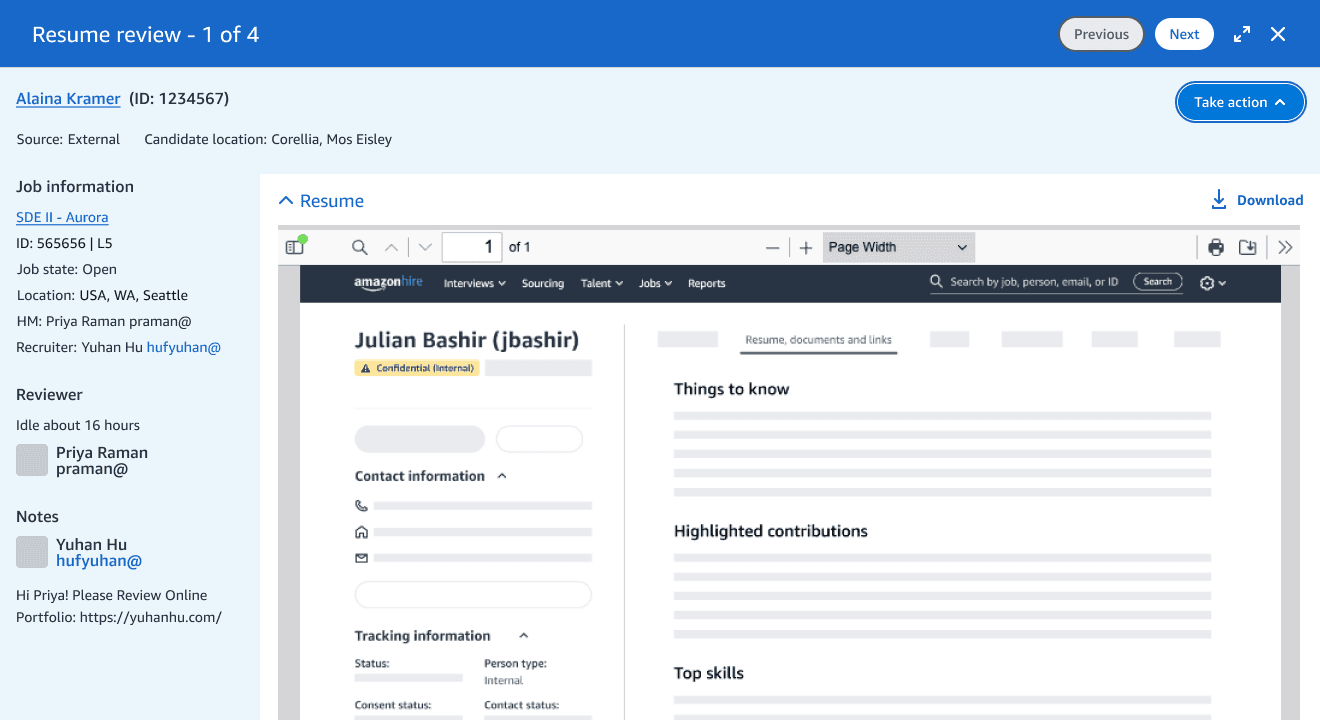
B — actions in a bottom bar
B — actions in a bottom bar

C — actions in a persistent sidebar
C — actions in a persistent sidebar
Preferred by 6 of 6

From migration to platform framework
The final direction balanced two competing needs.
Engineering efficiency
Reuse a common foundation instead of maintaining independent review experiences.
Customer experience
Preserve the information and interactions each audience actually needed.
The resulting framework was adopted across Rapid Review, Resume Review, the applicant landing page, the recruiting pipeline manager, and the job details page. It later influenced additional review experiences within Hiring Hub.
Rapid Review
Resume Review
Applicant landing page
Recruiting pipeline manager
Job details page
Five surfaces, one structure. Only the contextual zone changes.
Five surfaces, one structure. Only the contextual zone changes.
The two shipped experiences. Shared structure, opposite information density.
The two shipped experiences. Shared structure, opposite information density.
Rapid Review, for Recruiters

Resume Review, for Hiring Managers

Impact
An independent LEAST benchmark conducted after launch, in Q4 2025, showed strong customer satisfaction across both experiences.
Rapid Review
Recruiters
SUS SCORE
78
POSITIVE EASE OF USE
85%
POSITIVE ON EFFICIENCY
78%
The Rapid Review score reflects a phased rollout. This release focused on establishing a reusable framework while intentionally deferring several legacy workflow improvements to future iterations.
Resume Review
Hiring managers
SUS SCORE
82
POSITIVE EASE OF USE
92%
CUSTOMER SATISFACTION
88%
SUS averages about 68 across products, so 82 sits in the top band. The study was run independently of the design team, so these are measured results rather than estimates.
SUS averages about 68 across products, so 82 sits in the top band. The study was run independently of the design team, so these are measured results rather than estimates.
Beyond improving two workflows, the project turned an engineering migration into a reusable interaction framework that could scale across Amazon’s recruiting ecosystem.
Stakeholder feedback
“I’ve had the privilege of collaborating closely with Yuhan at Amazon, and she stands out as the most exceptional UX partner I’ve worked with at Amazon. Hands down.
New to the domain, she hit the ground running — conducting thorough customer research, systematically prioritizing pain points, and delivering remarkably detailed design specs for a complex legacy product redesign. What truly sets Yuhan apart is her principled advocacy: she consistently champions customer efficiency and accessibility, even when it means respectfully pushing back on engineering decisions. She is a team player and makes everyone around her admire her because of her warmth and collaborative nature. She’s also a wonderful mentor, guiding new UX team members with precision and care. A rare talent!”
Aman Thakur
Sr. Technical Product Manager at Amazon
Research participants are identified by role rather than name. Product screens are recreated with sample data.
Research participants are identified by role rather than name. Product screens are recreated with sample data.
