CASE STUDY
Doc Review Experience Redesign
A unified applicant review experience supporting both deep evaluation and high-volume screening for Amazon recruiters and hiring managers.

ROLE
Lead UX designer
Time
2025
SCOPE
UX strategy, research, UX design, prototyping, usability testing
CUSTOMERS
Recruiters and hiring managers
Impact
An independent LEAST benchmark conducted after launch in Q4 2025 showed strong usability results across both experiences.
Resume Review
Hiring managers
SUS SCORE
82
POSITIVE EASE OF USE
92%
CUSTOMER SATISFACTION
88%
Rapid Review
Recruiters
SUS SCORE
78
POSITIVE EASE OF USE
85%
POSITIVE ON EFFICIENCY
78%
Note: Rapid Review results reflect a partially modernized experience. Some legacy content and interaction patterns were outside the scope of this release.
The shared framework improved both review experiences while establishing a reusable foundation for candidate evaluation across Amazon Hire.
1. The challenge
A technical migration exposed a larger product problem
Resume Review and Rapid Review support two connected stages of candidate evaluation within Amazon’s recruiting system.
Rapid Review is used by recruiters to quickly assess a candidate’s background and determine whether they should move forward to a Hiring Manager.
Resume Review is then used by Hiring Managers to evaluate the candidate’s skills and experience before making the next hiring decision.
Resume Review needed to migrate to Amazon Hire as part of a broader platform modernization effort. Because Rapid Review had already been updated to meet the new platform’s technical requirements, Engineering proposed reusing its framework for Resume Review. This approach would significantly reduce implementation time and long-term maintenance costs.
Rather than directly adapting Resume Review to the existing framework, I first audited both experiences.
UX audit of the existing Resume Review and Rapid Review experiences

The audit revealed a larger issue: Rapid Review itself still had significant usability and scalability problems. Reusing it as-is would save engineering effort, but it would also carry existing UX limitations into Resume Review and make them part of the new platform foundation.
Rather than carrying Rapid Review’s existing UX debt into Resume Review and the new platform foundation, I proposed redesigning both experiences around a shared framework.
2. The direction
I proposed using the migration as an opportunity to redesign both experiences around a shared foundation, reducing duplicated design and engineering logic while leaving room for each workflow to serve different user needs.
3. Research
Understanding what should be shared, and what shouldn’t
After pushing back on the original reuse proposal, I led research with 6 Recruiters and 7 Hiring Managers to understand how each group reviews candidates, what information drives their decisions, and where the existing experiences break down.
Rapid Review: Recruiters needed more context
Interviews revealed that recruiters frequently left Rapid Review for Person Details Page to access communications, notes, duplicate profiles, and ownership information.
Resume review: Hiring Managers needed more focus
Interviews showed that resume readability and unnecessary information were major sources of friction. I also evaluated three structural concepts with HMs, with 6/6 preferring the large-resume + persistent-sidebar direction.
The takeaway: standardize the core review structure, while adapting information and interactions to each user group.
4. Solution
One framework, two purpose-built review experiences
I created a shared Review → Evaluate → Act model, with a consistent interaction structure and role-specific information hierarchy.
Rapid Review for Recruiters
Designed around high-frequency candidate review, bringing the operational context recruiters need closer to the resume and decision point.

Resume Review for Hiring Managers
Designed around focused candidate evaluation, prioritizing resume readability and simplifying the information surrounding the hiring decision.

The four shared zones, and what each audience gets in them
The four shared zones, and what each audience gets in them
Shared Zone
Rapid Review, for Recruiters
Resume Review, for Hiring Managers
Large resume area
Identical
Identical
Contextual information
Communications, notes, duplicate profiles, ownership, precheck status
Reviewer and notes only
Persistent actions
Move forward or disposition, with activity assignment
Move forward or not, with a recommended next step
Candidate navigation
Identical
Identical
Three zones are constant. One zone flexes. That is the whole framework, and it is why two audiences with different information needs could share a single foundation.

How I got there?
Auditing the proposed foundation
But reusing a newer product did not necessarily mean reusing a better experience.
I audited the existing Rapid Review and Resume Review experiences before moving forward with the proposed reuse approach. The audit showed that reusing Rapid Review as-is would carry existing usability and information gaps into the new Resume Review experience.
Translating research into role-specific requirements
Defining what each review experience needed to support
I synthesized the research into two sets of design requirements, clarifying which information and actions each user group needed at the point of review.
Rapid Review:
What recruiters needed
• Communications history
• Notes from the recruiting team
• Duplicate profiles
• Candidate ownership
• Automated precheck status
Establish context, then act.
Resume Review:
What hiring managers needed
• A readable resume
• Whether the candidate fits the role
• One clear move-forward decision
Judge fit, then decide.
Defining what stays consistent and what flexes
Sharing the structure, not the experience
I translated the research into a shared review framework with a consistent core structure and role-specific content.
I explored three structural directions for balancing resume visibility and decision actions. 6/6 HMs who evaluated the concepts preferred the large-resume + persistent-sidebar direction.
A. actions behind a header button
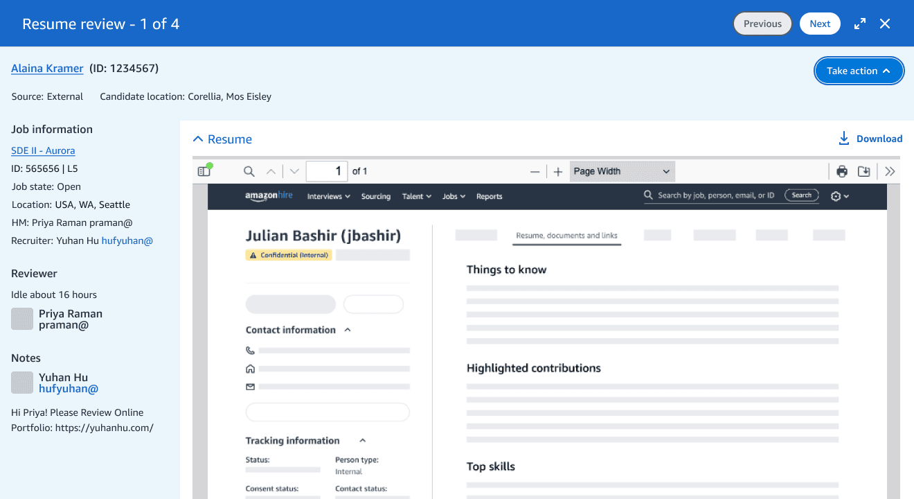
B. actions in a bottom bar

C. actions in a persistent sidebar (Preferred by 6/6)

4. Testing and refining the experience
Validating the design with real recruiting workflows
After redesigning the experience, I tested the prototype with 5 Recruiters to validate the new layout, information hierarchy, and decision interactions.
5/5 considered the new layout a clear improvement, while testing also surfaced refinements around repeated actions, defaults, and access to candidate context.
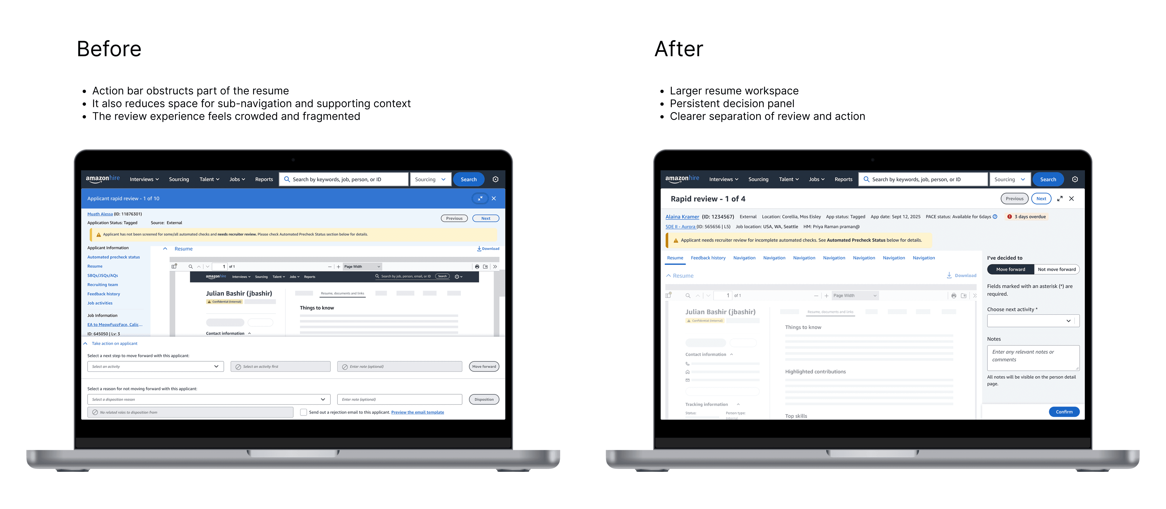
The redesigned layout reclaimed space for the resume, moved decisions into a persistent sidebar, and reduced competition between review content and supporting context.
From redesign to a scalable framework
What began as a technical migration became a reusable review framework. By redesigning both experiences together, I preserved the engineering efficiency of a shared foundation while allowing each workflow to support different users, information needs, and decisions.
Research participants are identified by role rather than name. Product screens are recreated with sample data.
Stakeholder feedback
Stakeholder feedback
“I’ve had the privilege of collaborating closely with Yuhan at Amazon, and she stands out as the most exceptional UX partner I’ve worked with at Amazon. Hands down.
New to the domain, she hit the ground running — conducting thorough customer research, systematically prioritizing pain points, and delivering remarkably detailed design specs for a complex legacy product redesign.
What truly sets Yuhan apart is her principled advocacy: she consistently champions customer efficiency and accessibility, even when it means respectfully pushing back on engineering decisions. She is a team player and makes everyone around her admire her because of her warmth and collaborative nature. She’s also a wonderful mentor, guiding new UX team members with precision and care. A rare talent!”
Aman T
Sr. Technical Product Manager at Amazon